Finparasite
Build Tester

Posts: 181

|
 |
« on: October 04, 2009, 12:59:04 AM » |
|
Old post: So here it goes. Many of you know that I had finished a map for ttt a while ago but I coud not get it to compile due some proplems whit my maps bad brushwork. Anyway I putted that map on hold and instantly started working on a new one. So here it is! Sreenshots: 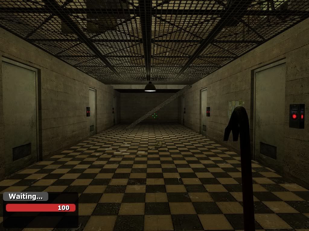 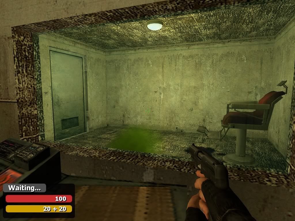 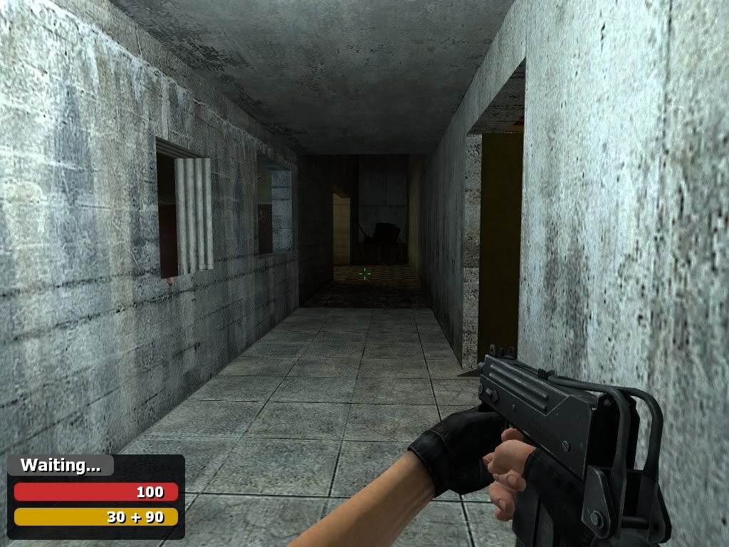 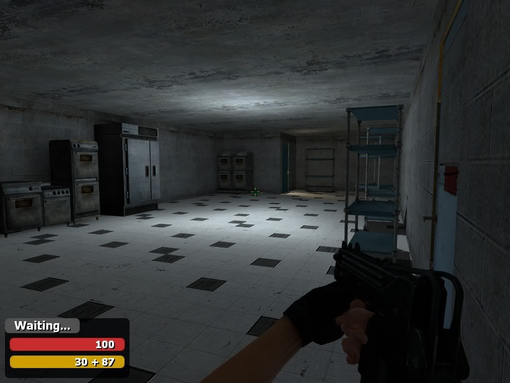 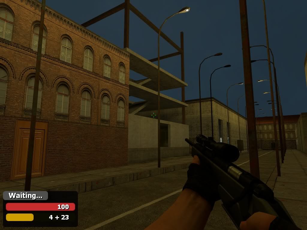 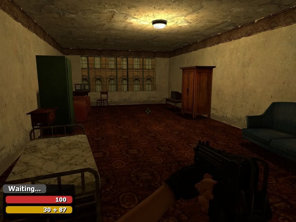 Download: Old P.S This map might be very filled whit bugs, I coud not test it with someone beacause of server problems. New post A3 released! Changelog: -Day lighting -Soundscapes -Traitorchecker (shamelesly ripped for tGB) -Fixes -Better detail -And some other stuff. Download: http://www.filefront.com/14835465/ttt_district_a3.zip |
|
|
|
« Last Edit: November 01, 2009, 12:31:50 AM by Finparasite »
|
|
|
|
Secone
Build Tester

Posts: 4289

Welcome to the Church of Rock and Roll!
|
 |
« Reply #1 on: October 04, 2009, 01:03:28 AM » |
|
Very nice, looks a lot better than your old one
EDIT: ohh was just about to click on the DL link
|
Worbat: When we're playing I love to hear him scream as I rape his ass
9:19 PM - Nel: Why is my 16 year old son married to a 20 year old man
Citizen: I want to see Morpheus' big black penis damn it!
Citizen_001: I JUST WANT TO HIT A BABY
|
|
|
Finparasite
Build Tester

Posts: 181

|
 |
« Reply #2 on: October 04, 2009, 01:17:23 AM » |
|
Ok, everything shoud be allright now! I had to fix a small game-breaking proplem whit the map.
|
|
|
|
|
OctaneHugo
Build Tester

Posts: 7668

hey, prince, you need a shave
|
 |
« Reply #3 on: October 04, 2009, 01:18:00 AM » |
|
Ooh looks good.
|
It's basically just like keeping your baby teeth when they fall out, except its a foot.
|
|
|
CrazyChicken
Poster
Posts: 604

Beep Beep Boop
|
 |
« Reply #4 on: October 04, 2009, 01:24:23 AM » |
|
Nice but don't use the combine button texture use the keypad prefab it looks much more sexy.
|
Most Neutral Poster
Release: ZM_BlackMesa1, TTT_Bank, TTT_Backalley
All my maps start with "B" hmm...
|
|
|
Finparasite
Build Tester

Posts: 181

|
 |
« Reply #5 on: October 04, 2009, 01:27:21 AM » |
|
Nice but don't use the combine button texture use the keypad prefab it looks much more sexy.
Will do in the next version. By the way this map is completly css and hl2 ep2 content free. Only thing that is requied to play is gmod! |
|
|
|
|
Ajunk
Build Tester

Posts: 14000

ಠ_ಠ
|
 |
« Reply #6 on: October 04, 2009, 04:50:33 AM » |
|
The curb it a bit too high.
|
You're all the most fucking heartless people
|
|
|
Finparasite
Build Tester

Posts: 181

|
 |
« Reply #7 on: October 04, 2009, 11:19:38 PM » |
|
There was this guy on alters server who told me that this map is horrible and that it sucks, even though he has never played it!
Do you guys think this is horrible? If so, what woud you like me to improve?
|
|
|
|
|
Ajunk
Build Tester

Posts: 14000

ಠ_ಠ
|
 |
« Reply #8 on: October 04, 2009, 11:25:19 PM » |
|
Construction yard is too clean and smooth.
|
You're all the most fucking heartless people
|
|
|
Killroy
Build Tester

Posts: 1541
|
 |
« Reply #9 on: October 04, 2009, 11:27:13 PM » |
|
All I can say is play with the lighting a bit in the bedroom.
|
I clicked on that link, but quickly closed the tab before it loaded upon realizing that the file name was whalecock.jpg.
|
|
|
Weighted Companion Cube
Build Tester

Posts: 4892

No longer staring into souls.
|
 |
« Reply #10 on: October 04, 2009, 11:32:29 PM » |
|
There was this guy on alters server who told me that this map is horrible and that it sucks, even though he has never played it!
Do you guys think this is horrible? If so, what woud you like me to improve?
Don't think your work is horrible because one person said so, especially if they've never played it. I'm sure it could use work, even the best of maps need tweaking, but I seriously doubt its that bad. |
Good morning. Korea is the user. But I also want to know that this question oeuigeot is olryeobop. I want to know, if I had issued snake god master's renewal, whether the people will use them? |
|
|
Finparasite
Build Tester

Posts: 181

|
 |
« Reply #11 on: October 05, 2009, 09:23:02 PM » |
|
Ok, so I talked to the guy today about my map and he said that when they played it everyone got lost and got angry and random dm:ed. I still dont get how you can get lost in a map so simple as this! Do you think its too complicated?
|
|
|
|
|
darkhazz
Poster
Posts: 87

I just look like i'm interested.
|
 |
« Reply #12 on: October 05, 2009, 09:42:28 PM » |
|
no, it's okay. Ramsi just seem to hate you.
|
|
|
|
|
Firespray
Build Tester

Posts: 1447

:-(
|
 |
« Reply #13 on: October 05, 2009, 10:31:29 PM » |
|
How could that guy get mad for getting lost? I enjoy getting lost occasionally on TTT. Brings up the suspense. Kind of like when I first played The Thing and was like, where the fuck are all the guns?! Now, I just know the location of one gun. So the big lost feeling sometimes is just pure epic.
|
Z3RO: Tanners sister isnt bad looking :v
Firespray: New sig
Z3RO: noooo holocalls traumatize worbat |
|
|
|
sulkdodds
|
 |
« Reply #14 on: October 06, 2009, 12:54:30 PM » |
|
Things I noticed immediately about the first screenshot: the buttons by the doors are enormous, and use the same texture for the sides of them for the front of them. This looks bad.
The side of the stairs uses a generic metal texture like the ceiling does, which has an incongruous x/y cross pattern when the actual object is set diagonally. This also looks bad. The sides should probably be just straight metal (I mean just google image search 'metal staircase').
The stairs have no hand rails. Personally I think this looks weird, and anyway it's a major health and safety risk.
Second screenshot: it doesn't quite seem right that the floor and the ceiling in that room have the same texture.
The texture that covers the inner surface of the (INCREDIBLY THICK) window space is ugly and it doesn't make much sense that a glass pane would be held directly in what looks like concrete. I dunno.
|
|
|
|
« Last Edit: October 06, 2009, 12:57:14 PM by sulkdodds »
|
if I were not Sulkdodds, I should wish to be Diogenes
|
|
|
Finparasite
Build Tester

Posts: 181

|
 |
« Reply #15 on: October 06, 2009, 03:10:12 PM » |
|
Second screenshot: it doesn't quite seem right that the floor and the ceiling in that room have the same texture.
First of all, they are not the same texture. The other one is a floor texture and the other one is a ceiling texture. They do look like the same texture so its not a big mistake to think that they are the same. I consider changing it. Things I noticed immediately about the first screenshot: the buttons by the doors are enormous, and use the same texture for the sides of them for the front of them. This looks bad.
The side of the stairs uses a generic metal texture like the ceiling does, which has an incongruous x/y cross pattern when the actual object is set diagonally. This also looks bad. The sides should probably be just straight metal (I mean just google image search 'metal staircase').
All the things you said here are true and I will fix them all, but you coud have pointed out some less noticable flaws. But meh. The texture that covers the inner surface of the (INCREDIBLY THICK) window space is ugly and it doesn't make much sense that a glass pane would be held directly in what looks like concrete. I dunno.
I will consider changing this, since it does look pretty weird, its the same texture that is used to the ceiling. |
|
|
|
|
FBC
Build Tester

Posts: 5473

Forum Drunk
|
 |
« Reply #16 on: October 06, 2009, 03:18:00 PM » |
|
For the building under construction, you might want to add some yellow tape or those plastic orange fences construction companies are so fond of, so it isn't so bland.
You could also use the construction site as an excuse to slap a crane down outside the actual play area and have a platform hang over the street.
|
I hate everything that isnt boobs
except one pair of boobs which I hate too hate hate hate these are the boobs of betrayal
|
|
|
Finparasite
Build Tester

Posts: 181

|
 |
« Reply #17 on: October 06, 2009, 09:53:50 PM » |
|
A2 relased!
Changelog:
-Added one new building
-Some of the roofs are now acessable areas
-Fixed some bugs
-Added 3d skybox (I know its not very good and looks kinda bland but I didn't care to mess with this any more so I just relased it with the unfished 3d skybox
-Removed all of the custom textures to make the filesize smaller (3,7 mb)
-Changed the skybox texture
-Added new weapon spawns
I think thats it
Download: http://www.filefront.com/14670837/ttt_district_a2.zip
P.S I know I promised a traitor and a weapon checker to this version but they were kinda hard to make to work propely, so I relased this version whitout them. Also, I promise they will be included in the next version.
Edit: As you might have seen from the original post, I was really tired and my grammar was pretty bad. I made this edit to fix those grammar errors.
|
|
|
|
« Last Edit: October 07, 2009, 12:25:44 PM by Finparasite »
|
|
|
|
Darkest_97
Poster
Posts: 286

Hi.
|
 |
« Reply #18 on: October 18, 2009, 02:51:07 PM » |
|
I love this map its my new favorite.
Im pretty sure this is on the new version: when your walking up the stairs in the jail you cant keep walking at the top and you have to jump up. But maybe its just me not being able to walk up stairs...
|
|
|
|
|
Finparasite
Build Tester

Posts: 181

|
 |
« Reply #19 on: October 18, 2009, 04:10:18 PM » |
|
I love this map its my new favorite.
Im pretty sure this is on the new version: when your walking up the stairs in the jail you cant keep walking at the top and you have to jump up. But maybe its just me not being able to walk up stairs...
Well thank you. It allways makes me feel better when someone says something good about anything I have done. Anyway there is a problem at the stairs, the last step is too high making it impossible to walk up them. I will fix it as soon as I can. |
|
|
|
|


